
2019 is proving to be the year of brand remakes. The film industry has released multiple iconic movie reruns to impressive acclaim, including 70’s classic ‘A Star is Born’ and family favourites ‘Mary Poppins’, ‘Aladdin’, ‘Dumbo’, ‘The Little Mermaid’ and ‘The Lion King’. These hugely popular classics have not simply been ‘remade’ but rather reinvented. They have been transformed into modern masterpieces, making use of the latest technology and adapting themes, styling and even storylines to meet the demands and expectations of their present-day audiences.
This week, we ask whether this trend has found its way into the commercial world. Here are some examples of high profile brands which have taken on rebrands this year to stay ahead of the competition and updated their brand communications in order to remain relevant with their ever-evolving target audience and marketplace.
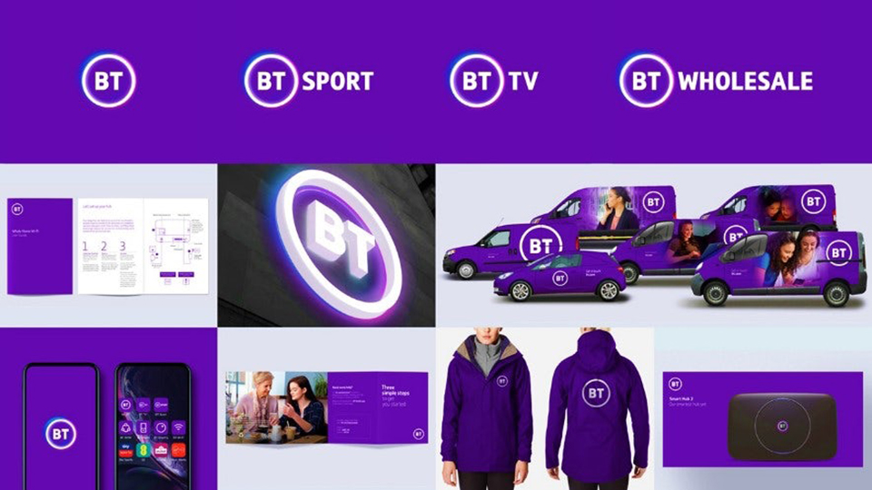
BT
BT, the institutional multinational telecoms group formerly known as ‘British Telecom’ has understood that rebranding is essential to stay relevant.
BT are not rookies when it comes to rebranding. Their rebranding is clever and well thought out. With digital becoming a core focus of their marketing activity, BT knew that they needed to adapt their logo and its variations. The last logo was designed for the pre digital world where most of the brand’s communications were created for print. Today, 90% of the brand’s consumer touchpoints are digital.
Following the current market trend, BT have gone for a paired-back design which incorporates different colour fades. The simple use of typography translates well in the digital world, particularly with iconography, and is easily adapted to their various product offerings. Less clutter means that BT can clearly communicate its multiple product offerings under a strong principle brand identity.
Walkers
Walkers recently launched their biggest ad campaignto date. Teaming up with the Spice Girls, the objectives were not only to announce the newly formulated cheese and onion flavour, but to become a talking point once again. Walkers are a well known brand which hold the top spot for crisps in the UK. A complete rebrand was not needed here. However, Walkers recognised the need to rejuvenate their communications in order to remain relevant and stay ahead of the game through increasing talkability around the brand. Offering a chance to win tickets to go on tour with the Spice girls, Walkers created an ad campaign asking followers to show that they are the Girl’s biggest fan. A TV ad highlighting the campaign was first aired on primetime TV on 2nd June during the Britain’s Got Talent Final, showing the Spice Girls surprising the winner only to find that he would not share his Walkers with the band! Marketing Director, Fernando Kahane, estimated the ad would reach 17 million in the first eight hours after its launch, and an impressive 70% of the British population in the first week.
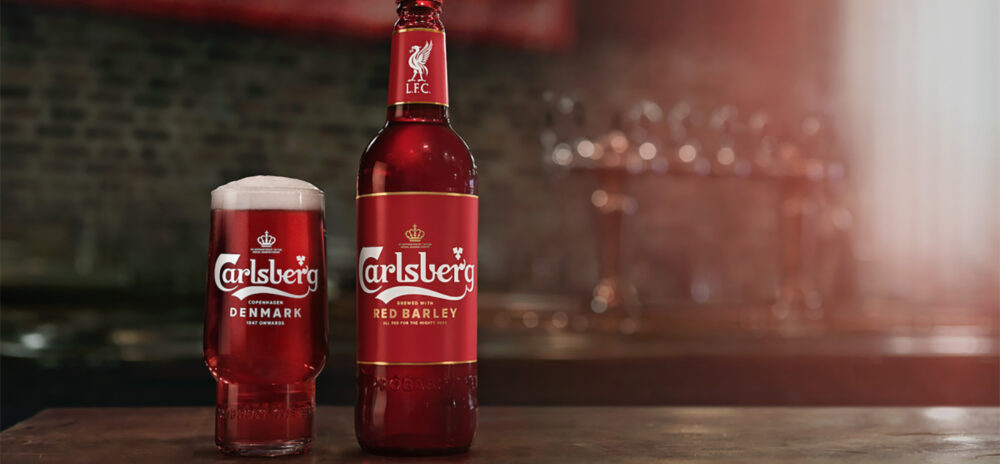
Carlsberg
Carlsberg took a fresh approach to brand rejuvenation recently. Celebrating their longstanding relationship with Liverpool FC, the longest association in Premiership football, Carlsberg created a unique Anfield-red bottle .. But Carlsberg went one step further – not only were the bottles red, Carlsberg also brewed a one-of-its-kind red beer. The beer was made from hops which had been grown in a room playing the last 25 years of Liverpool matches, allowing the plants to ‘absorb’ the true atmosphere of Liverpool FC. The progress of making this rare beer was well documented throughout the campaign with visits from Liverpool players and Jurgen Klopp. . The bottles are now seen as a collector’s item going for £12 each. Harnessing the global reach of the Liverpool FC fanbase, Carlsberg has embraced the passion and rich history of the club in a genuine and engaging sponsorship activation campaign. And with Liverpool winning the Champions League last weekend, their timing simply couldn’t be better!
Instagram have introduced their new look with redesigning their logo to unify their growing family of apps. The new logo uses a rainbow colour scheme and has removed their name from beneath the icon – a move reflective of its importance within the digital world. With the expansion of Instagram apps, including Layout, Boomerang and Hyperlapse, the new minimalist design helps bring together a cohesive and instantly recognisable group brand. The changes were not for the sake of novelty but to unite the company’s expanding product offering and to improve customer experience and usability within their 1.6 billion strong mobile based audience.
Many brands have undertaken effective rebranding activity. Rebranding does not have to mean a complete overhaul in design – a rejuvenation of a brand’s core message can be just as effective. Minor tweaks to brand communications, updating design to adapt to the digital world, timely and well thought-out campaigns can help target new audiences and maintain brand relevance in an evolving market.
If you are looking to rejuvenate your brand or are in need of a fresh look at your marketing activity , we’d love to hear from you, please get in touch to speak to a member of our team.